
Templates
Apply the Brand With Confidence
These templates are designed to help create a sense of unity across the colleges, schools and units that make up The University of Texas at Austin. They help drive a consistent message that UT is the flagship university of Texas and one of the top academic institutions in the world.
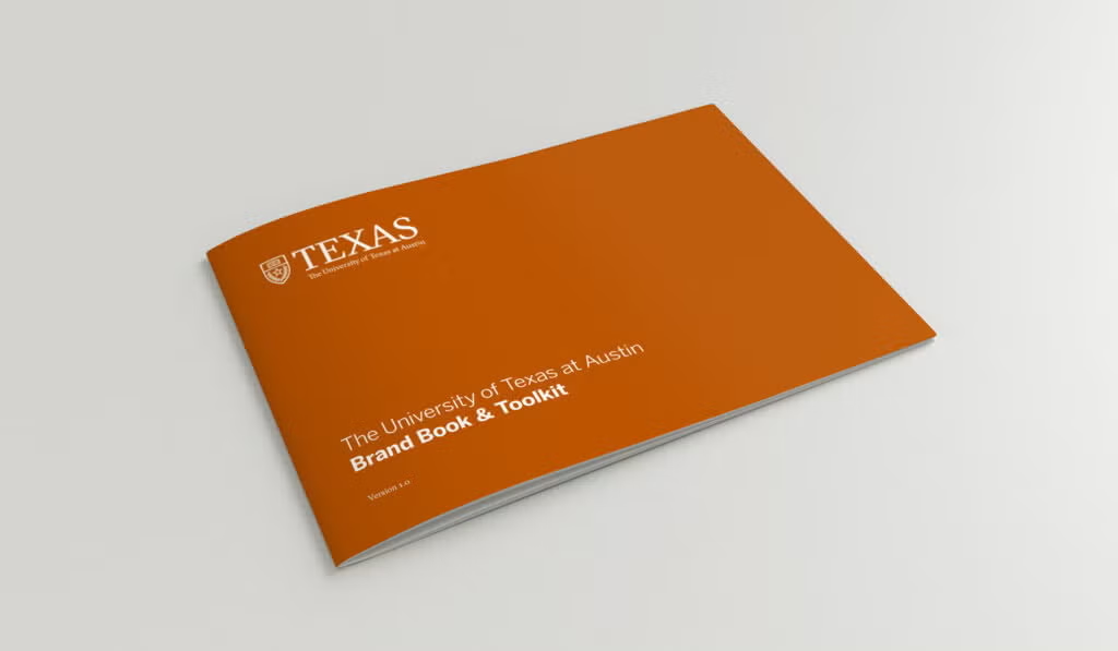
Brand Book & Toolkit
A comprehensive guide to the University’s voice and tone, messaging strategy, logos, colors, typography, photography, textures and patterns, and iconography, our Brand Book & Toolkit is the go-to resource for marketing and communications professionals across campus.
Canva for Campus
Canva for Campus is the University’s enterprise version of Canva, available to faculty and staff. It provides access to UT-approved brand assets and templates, making it easier to create professional, on-brand digital and print materials.
Getting Started
Licensing, account setup, training and technical support are managed by UT Enterprise Technology. Visit the Canva for Campus page to request a license, transfer an existing Canva account and learn more about campus resources.
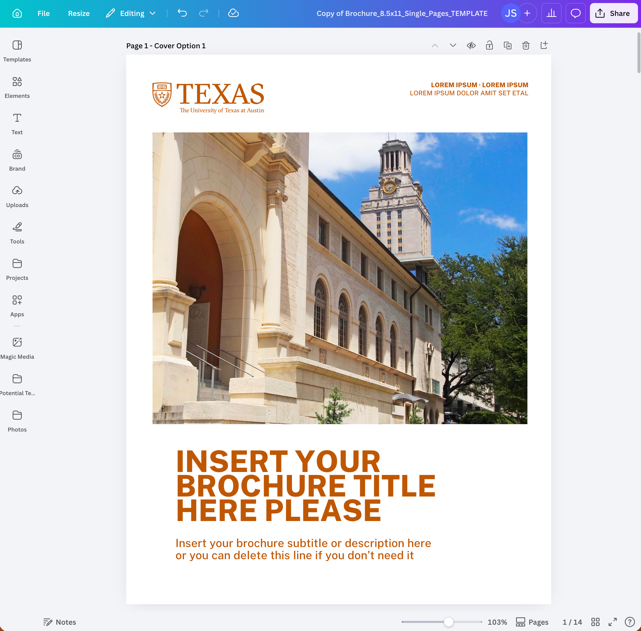
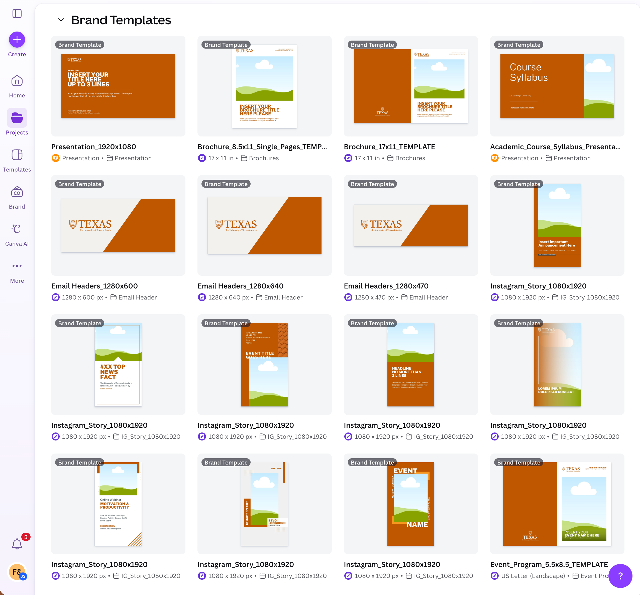
Using Canva Brand Templates
The UT Brand Kit and approved templates are available within Canva for Campus to support a wide range of digital and print projects. Select the template that best fits your communication needs while maintaining brand consistency.
To access brand materials within Canva:
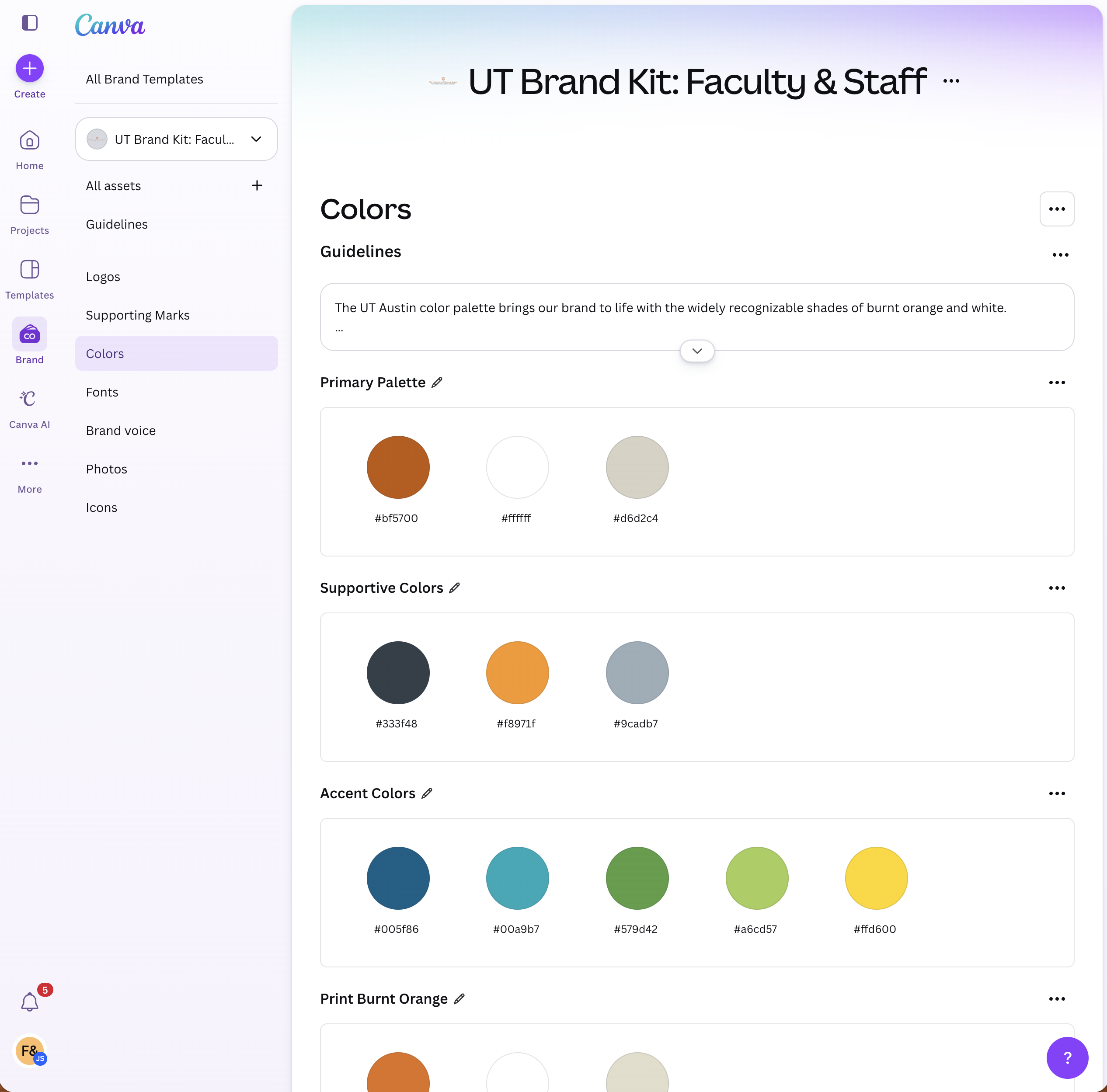
- Click Brand in the left navigation to view the UT Brand Kit.
- Click Projects, then Folders, and select Brand Templates to browse available templates.
Suggestions for additional templates?
Email Signature
Your email signature is a direct representation of the University’s viewpoint. Use basic contact information and include assigned fonts and colors only.
This template can be copied and pasted into your email client:
FIRSTNAME LASTNAME, Title
The University of Texas at Austin | Department | 512-XXX-XXXX | utexas.edu
Email Signature Specifications
- Type Size: 10pt
- Typeface: Arial
- Colors: Gray (RGB 51, 63, 72 or #333F48) and Orange (RGB 191, 87, 0 or #bf5700)
Include the following information:
- Name
- Title
- The University of Texas at Austin
- College/school or department
- Phone number
- UT or CSU Website (optional)
Email Signature Tips
- Use a physical address only if it is necessary for your job.
- Use the main phone number where you want to be reached; do not include a fax number.
- Manually input the colors to get the official UT colors. Do not select an orange or gray from the basic color menu.
- Do not add extra icons, logos, taglines or social media image links to your signature; images can come across as attachments and appear chaotic, and many email clients and mobile devices block them.
- Personal quotations or philosophical statements should not be included as part of your signature. Your email signature is a direct representation of the University’s viewpoint.
HTML Email
Nothing has more competition than email. Branding and formatting will help you cut through the noise.

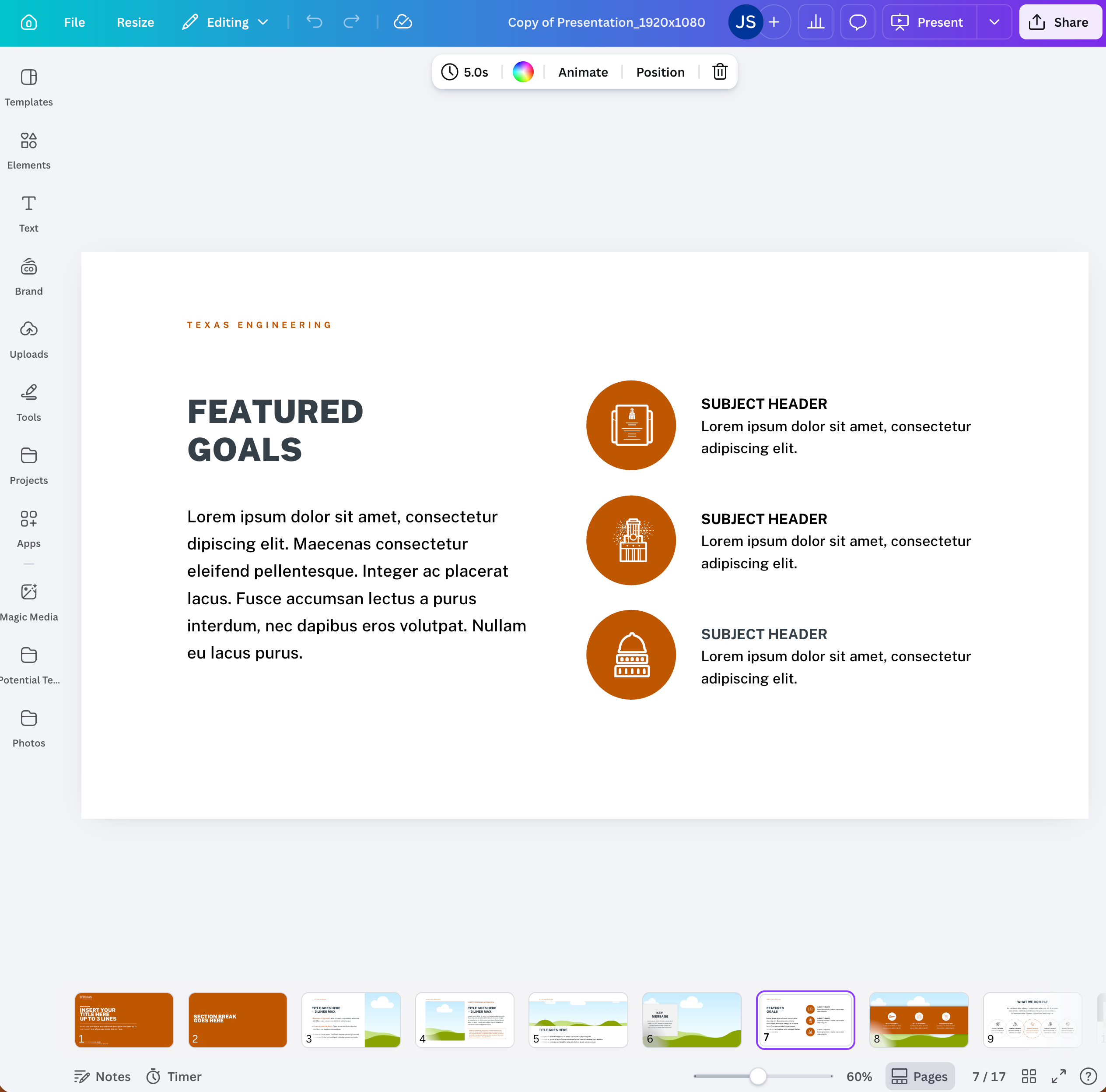
Presentations
Presentation templates help create professional presentations that consistently represent the UT brand.
- Be consistent with your font selection; we recommend Arial or Open Sans.
- Choose a font size appropriate for your presentation context. A one-inch letter is readable from 10 feet, a two-inch letter is readable from 20 feet and a three-inch letter is readable from 30 feet.
- If you use a light background, use dark text. If you use a dark background, use light text.
- Align text left or right. Centered text is harder to read.
- Don’t use paragraphs; use bullets or short sentences, and aim to keep each point to one line.
- Use images sparingly and thoughtfully; avoid over-designing your pages with special effects.

Stationery
A uniform paper system with business cards, letterhead and envelopes is a basic building block of brand consistency.

